 On March 15, 2017, California begins field testing a new website designed to help communities across the state access important information about K-12 districts and schools. Called the California School Dashboard, the site features easy-to-read reports on multiple measures of school success, including test scores, graduation rates, English learner progress and suspension rates.
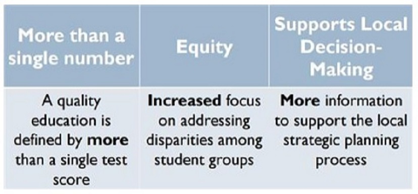
The Dashboard delivers information that can make a real impact on the classroom and shine a light on disparities so that our schools can work to better align resources where they are most needed.
The Dashboard is part of California’s new school accountability system based on 2013’s Local Control Funding Formula (LCFF). It is the next step in a series of major shifts in public education that have raised the bar for student learning, transformed testing and placed the focus on equity for all students.
With the new Dashboard, districts and schools have access to information they need to make the best local decisions, and help them align resources to student outcomes through Local Control Accountability Plans (LCAP).
To learn more about California’s accountability and continuous improvement efforts, visit the CDE Dashboard Web page.
Why a new system and tool?
The Dashboard is a key part of California’s commitment to transparency and continuous improvement. California’s future success depends on tapping into the potential of all students, so they graduate ready for college, careers and life. For schools to reach this goal, teachers, parents and the community need clear and useful measures of progress. As an accountability tool, the Dashboard will help the state identify schools (including charter schools) and districts needing targeted assistance.
What’s different?
In the past, accountability systems for districts and schools relied solely on test scores. But one test taken on one particular day doesn’t provide a complete picture of all the ways schools are helping students succeed.
Think of it this way: You can’t drive a car by only watching the speedometer. You also keep your eye on the road, check the mirrors, monitor the gas tank and pay attention if the engine light comes on. Similarly, the Dashboard provides information on different aspects of student performance, which will give a more complete picture of a school’s progress. The Dashboard also reports on growth to show a school’s trajectory over time.
What’s next?
The Dashboard is deliberately designed to be a work in progress. Metrics and reports will be added over time. During the field testing phase, the state will be gathering feedback to make additional modifications.
The exciting changes taking place in education will take time to fully implement. While schools are making progress in many key areas there is always more work to do. The Dashboard is part of an ongoing conversation with our community on both how we’re doing and how we can do better. Meeting goals will take a united effort, and I look forward to working with our families to ensure success for every student.
What indicators are measured?
Each year, the California School Dashboard will display scores based on about a dozen state and local indicators. These indicators are specifically aligned with 10 priority areas spelled out in the state’s Local Control Funding Formula. The same priority areas are also embedded in the local accountability plans that are updated annually by districts.
Not all indicators are included in the March 2017 field test of the California School Dashboard.
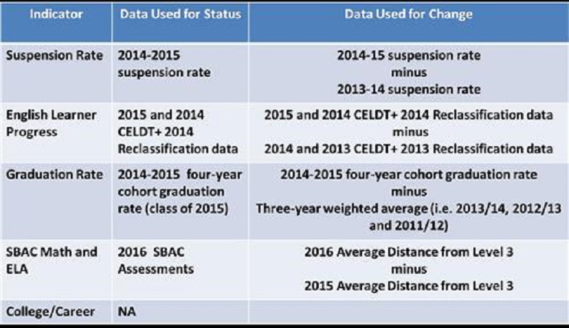
State indicator results will be based on how schools or subgroups performed overall (known as their “status”), as well as how much they improved or declined over a three-year period (referred to as “change”).
What indicators are included in the March 2017 field test?
The state indicators and Pasadena Unified data used for the March 2017 Dashboard are:
Visual Performance & Growth
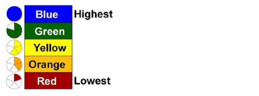
For the state indicators, color-coded pie pieces will represent school and subgroup performance levels. Ranked from least favorable to most favorable, the performance levels are red (one slice), orange (two slices), yellow (three slices), green (four slices) and blue (a full pie).
You can learn more about how each color is assigned by visiting the California Accountability Model & School Dashboard webpage, but the general idea is that the colors are gauges of how well the school or subgroup performed overall (status) and how much it improved or worsened over a three-year period (change)
Pie chart


